Web Design Mistakes That Can Cost You Leads
Key Takeaways
A website can look good and still lose leads if the design creates friction before a visitor takes action.
The biggest lead-killing mistakes usually involve speed, unclear calls-to-action, long forms, weak trust signals, confusing navigation, mobile issues, generic content, and technical SEO gaps.
Good website design is not only visual. It is the structure that helps people understand the offer, trust the business, and know exactly what to do next.
A recurring website audit is more useful than a one-time redesign because websites drift as offers, tools, plugins, pages, and customer expectations change.

ARE YOU STILL TRYING TO DO IT ALL?
Discover the SMART way to delegate without losing control—and finally free up your time.
I have reviewed websites that were getting traffic, but the leads were not coming through. At first glance, the site looked fine. The colors matched the brand, the pages were live, and the contact form was technically there. But when I looked closer, the problem was clear: the page loaded slowly, the offer was buried, the button did not stand out, and the visitor had to work too hard to understand what to do next.
That is why web design mistakes are not always obvious. They are usually small choices that quietly add friction. A slow page here. A confusing menu there. A form that asks for too much too soon. In this guide, I will walk through the design mistakes I check first when a website is getting attention but not enough leads.
Why Is Website Design Important for Getting Leads?
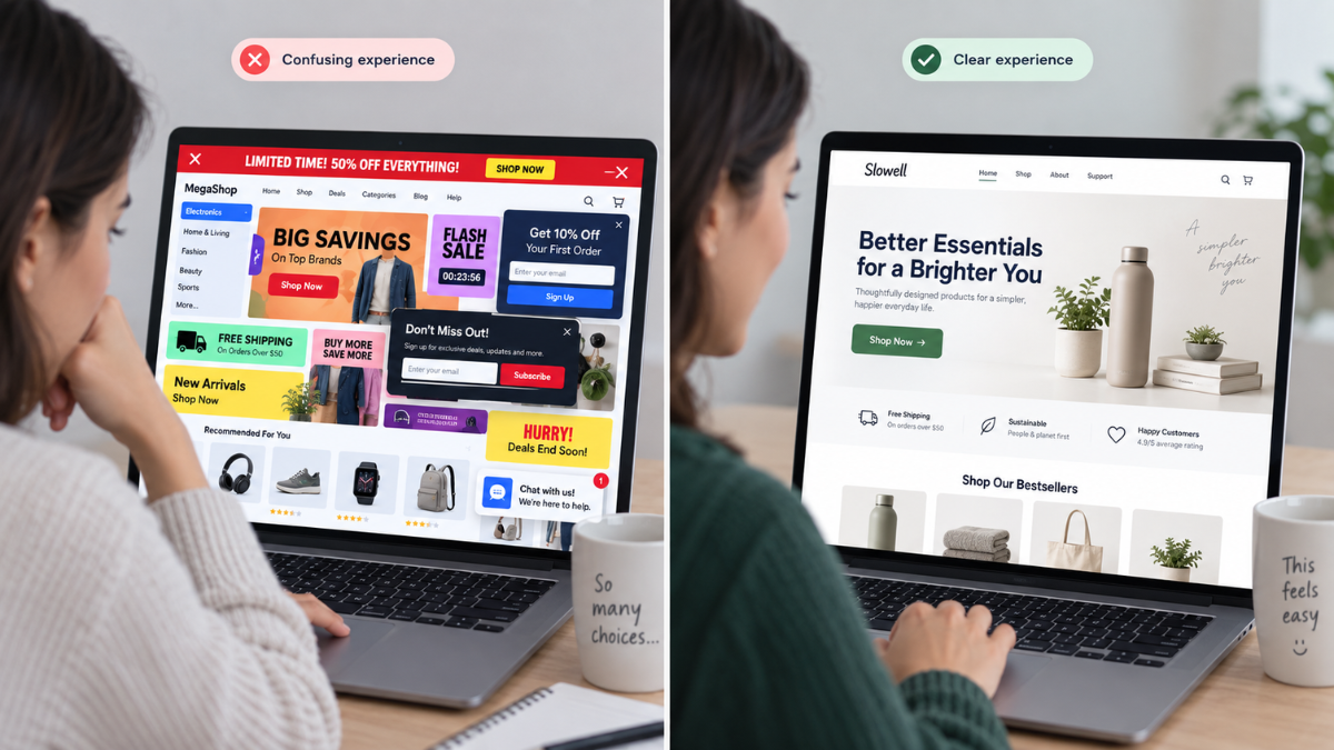
Website design is important for getting leads because it shapes the visitor’s first impression and guides the next action. Design is not only about making a page look modern. It is about helping the right person quickly understand what the business offers, why it matters, and what step to take next.
When I review a lead generation website, I look at the page the way a first-time visitor would. Can I tell what the business does within a few seconds? Can I find the service that matches my problem? Do I trust the business enough to book a call, fill out a form, or keep reading?
This is also why Smart VAs positions website support as part of a managed remote team of specialized professionals instead of treating the site as a one-time design project. A website has to keep supporting the business after the first version goes live.
Is Slow Page Load Time Quietly Driving Leads Away?
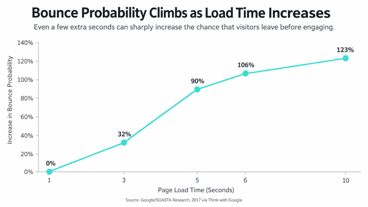
A slow site can weaken trust before the visitor reads a single headline. From a design perspective, speed is part of the user experience. Large images, too many plugins, heavy scripts, outdated theme code, and uncompressed media can all make a page feel clunky.
I do not like guessing here. I usually start with a page speed check, then look at the most common culprits: image size, unnecessary animations, unused scripts, and layout shifts that make the page feel unstable. Google’s PageSpeed Insights reports on a page’s user experience across mobile and desktop and gives suggestions for improvement, so it is a helpful starting point for this kind of review.
The fix is not always a full rebuild. Sometimes the lead loss comes from a few practical improvements: compressing images, simplifying the top section, removing unused tools, cleaning up code, and making sure the most important content loads quickly.
Are Your Calls-to-Action Actually Visible and Compelling?
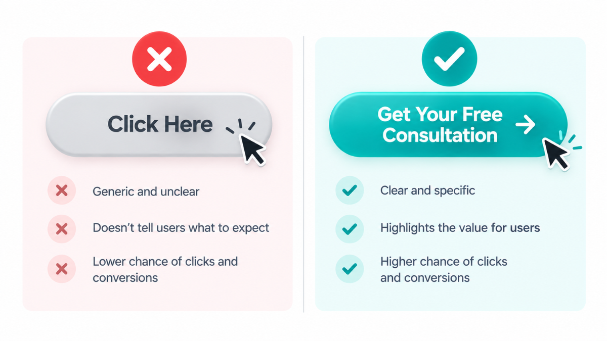
A call-to-action should not make visitors guess. If the main button says “Submit” or “Click Here,” the visitor still has to interpret what happens next. A stronger CTA makes the action specific: book a consultation, request a quote, download the guide, or schedule a website review.
The placement matters too. I often see CTAs buried at the bottom of a page or hidden behind vague sections. A good lead generation page gives visitors multiple natural opportunities to act: near the top, after the offer is explained, after trust signals, and near the close.
When I work on website layouts, I check whether the CTA matches the visitor’s level of intent. Someone on a service page may be ready to book. Someone on a blog may need a softer next step. The design should guide both without feeling pushy.
Is Your Lead or Contact Form Too Complicated to Complete?
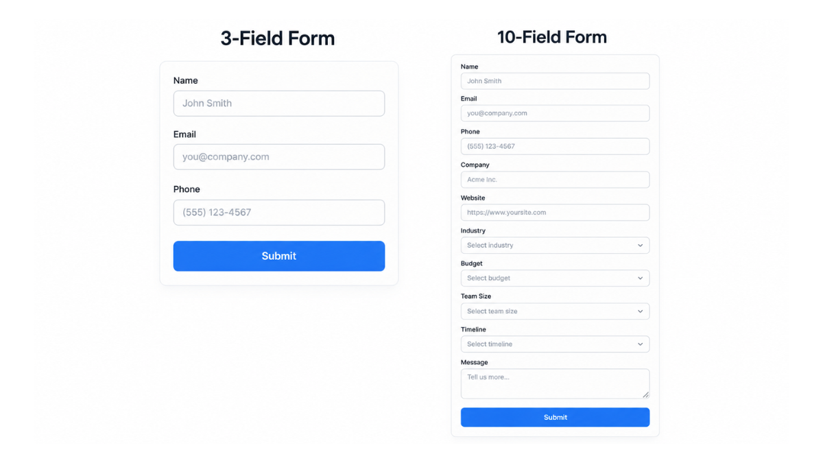
A lead form should ask for what the business actually needs at that stage, not everything the team might want eventually. Long forms can feel like homework, especially when the visitor is still deciding whether to trust the business.
I check form design for three things: the number of fields, the clarity of labels, and the way errors are handled. W3C’s form guidance emphasizes clear labels, instructions, and feedback, which matters because a confused visitor is more likely to abandon the form than fight through it.
A better form usually keeps the first step simple: name, email, and one useful qualifying question. Deeper questions can happen after the lead starts the conversation. The design goal is to reduce hesitation, not collect every detail upfront.
Does Your Site Lack the Trust Signals Leads Need Before Converting?
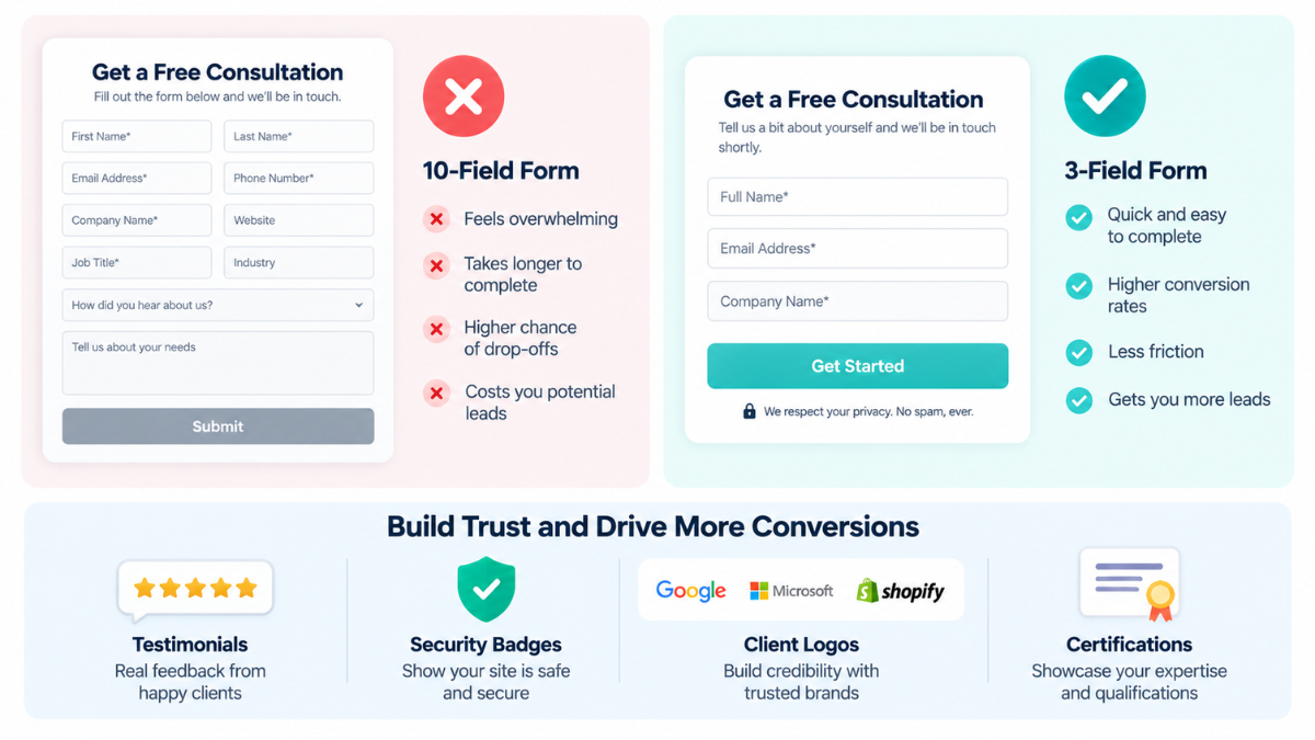
Trust signals matter because a new visitor does not know the business yet. They are looking for proof that the company is real, reliable, and capable of delivering what it promises.
Common missing trust signals include testimonials, client logos, case studies, industry experience, security cues, clear contact information, and real examples of work. Even strong copy can feel thin when there is no proof around it.
I see this clearly in Melissa Martin’s Creative Island project support. Her work involved websites, design, copy, blogs, and social content moving together, which is the kind of support that helps a business feel more confident sending clients through its digital presence. For website design, that lesson is important: a page should not only look finished. It should make the business feel credible and ready for the next opportunity.
Is Confusing Navigation Making It Hard for Leads to Find What They Need?
Navigation is one of the easiest places for leads to get lost. A visitor should not have to decode internal language, dig through crowded menus, or click through several unrelated pages just to understand the services.
When I audit navigation, I check the top menu, footer, service page paths, and mobile menu. I ask: Can someone reach the most important page in three clicks or fewer? Are the labels clear? Is the contact path obvious? Are related services grouped logically?
Confusing navigation is often a sign that the website grew without structure. New pages were added over time, but the user journey was never cleaned up. A design refresh should simplify that journey so leads can move from interest to action without friction.
Is Your Website Actually Optimized for Mobile Visitors?
Mobile optimization is more than making the page shrink to fit a smaller screen. A mobile visitor needs readable text, buttons that are easy to tap, forms that are simple to complete, images that load quickly, and content that appears in a logical order.
Google’s mobile-first indexing guidance recommends creating a mobile-friendly website and making sure the mobile version can be crawled and indexed properly. That connects mobile design to both visibility and conversions. If the mobile version is hard to use or missing important content, the site can lose opportunities before visitors ever reach the contact form.
I always check mobile manually. Automated tools are useful, but they do not replace tapping through the site like a real visitor. If a button is too small, the menu is awkward, or the form is frustrating, those details can cost leads.
Are AI-Generated Content and Generic Design Quietly Hurting Trust?
AI can help speed up brainstorming, but unedited AI copy and generic visuals can make a website feel interchangeable. Visitors can usually sense when a page sounds like it could belong to any company in the same industry.
The warning signs are easy to spot: broad claims, no specific examples, stock-perfect images, repetitive phrases, generic service descriptions, and missing proof. A visitor should feel like the business understands their actual problem, not like the page was filled in from a template.
This is where website design and content strategy overlap. Strong design needs specific messaging, and SEO-friendly blog posts can support that by giving visitors helpful, relevant content instead of generic filler. The page still needs a human review before it goes live.
Are Technical Gaps Keeping Leads From Finding Your Site at All?
Some lead generation problems start before the visitor reaches the website. If search engines cannot understand the page, crawl the right links, or read the structure clearly, the site may struggle to attract qualified traffic.
I check for missing meta titles and descriptions, broken links, missing alt text, weak internal links, missing schema, and pages that are not connected to the main service structure. Google’s SEO Starter Guide explains that good alt text helps search engines understand images, while Google’s link best practices note that internal anchor text helps both people and Google make sense of a site.
For businesses that need more than a visual refresh, technical SEO support can help make sure the site is not only cleaner for visitors but easier for search engines to understand. This also pairs well with conversion-focused website design support when the goal is better visibility and better lead flow.
How Do You Audit Your Own Website for Lead-Killing Mistakes?
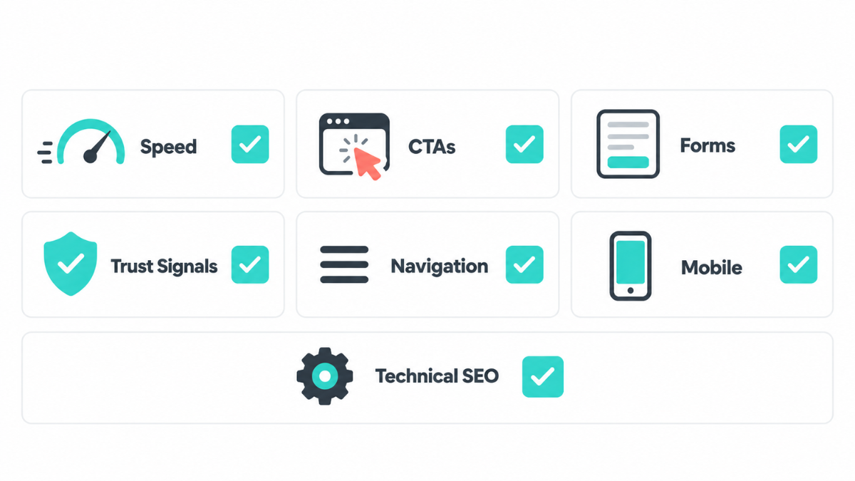
A basic website audit does not need to be complicated. Start with the homepage, one service page, one blog post, and the contact page. Review each one on desktop and mobile. Then ask whether a new visitor can quickly understand the offer, trust the business, and take action without confusion.
I recommend checking speed, CTA placement, form length, navigation, trust signals, mobile experience, broken links, page titles, and whether the content sounds specific to the brand. Small fixes in these areas can make the site feel more helpful almost immediately.
This is also why web design best practices should be revisited regularly. A site can be clean when it launches and slowly drift as new offers, pages, forms, plugins, and content updates are added.
What Happens When You Ignore These Website Mistakes?
The cost usually shows up quietly. Fewer people book. More visitors bounce. Sales calls start with confusion. Paid ads send traffic to pages that do not finish the conversation. Blog readers arrive, but they do not know where to go next.
When I look at why a website is not converting, I rarely blame one design issue alone. It is usually the combination: weak page speed, unclear messaging, missing trust, and a path to conversion that asks the visitor to do too much work.
A website also has to be built for where the business is going. That is why the question is not always whether to hire a web developer or build it yourself. The better question is whether your current website setup can support the leads, offers, and campaigns you want to run next.
Getting a Second Set of Eyes on Your Website
Most lead loss comes from a handful of fixable patterns, not one dramatic failure. The problem is that business owners are often too close to their own websites to see the friction clearly. A section that feels obvious internally may confuse a first-time visitor. A button the team knows to click may be invisible to someone new.
A Website Design Specialist can review the site with fresh eyes, clean up design issues, improve the user journey, and handle ongoing updates without pulling the owner away from daily business decisions.
The same support structure can also help with the surrounding pieces that affect conversion, including content updates, SEO checks, and page improvements. Understanding the difference between website design and development makes that easier because design shapes the experience while development supports the functionality behind it.
If your traffic is coming in but leads are not converting, the site may not need to be thrown away. It may need a careful audit, cleaner design choices, stronger proof, and a clearer path from first visit to next step.
Book a Discovery Call with Smart VAs to get the right website support in place.
Smart Virtual Assistant
👍🤵
Smart Virtual Assistant 👍🤵
What if you could reclaim 40 hours this month?
Find out inside this free guide.
Frequently Asked Questions
-
The most common mistake is making the next step unclear. A site may look polished, but if the visitor cannot quickly understand the offer, trust the business, and find a clear call-to-action, leads drop. I usually check the headline, CTA placement, proof points, and mobile layout first.
-
Page speed affects lead generation because a slow page creates friction before visitors can read the offer or complete a form. It can also make the business feel outdated or hard to work with. I recommend checking both mobile and desktop speed, then fixing large images, heavy scripts, and unnecessary tools.
-
A lead capture form should only ask for what the business truly needs to start the conversation. For many service businesses, name, email, and one qualifying question is enough for the first step. Longer forms can work later in the sales process, but they often reduce early conversions.
-
Outdated web design can hurt SEO when it creates technical and usability problems. Poor mobile experience, slow pages, broken links, missing alt text, weak internal links, and unclear page structure can limit how well search engines understand the site. Design and SEO work best when they support each other.
-
I recommend a light website audit every quarter and a deeper review whenever the business changes offers, launches campaigns, updates branding, or sees a drop in leads. Websites drift over time. Regular checks help catch broken links, outdated copy, slow pages, and conversion issues before they cost opportunities.
About the Author:
Micca, Website Design Specialist, SmartVAs

Micca is a Web Designer and UI/UX Specialist at Smart VAs with expertise in graphic design and creating engaging digital content. She focuses on designing user-friendly web experiences while combining strong visual design principles with effective UI/UX practices.
With a keen interest in web design and management, Micca continually explores new design approaches and techniques to create engaging experiences, communicate ideas effectively, and support brands in building a stronger digital presence.